Clarity is always important when creating EvolveYou communications. Colour should be applied intelligently to ensure visuals are easy to understand. High contrast between text and background give people the best chance of reading and understanding what we have to say.
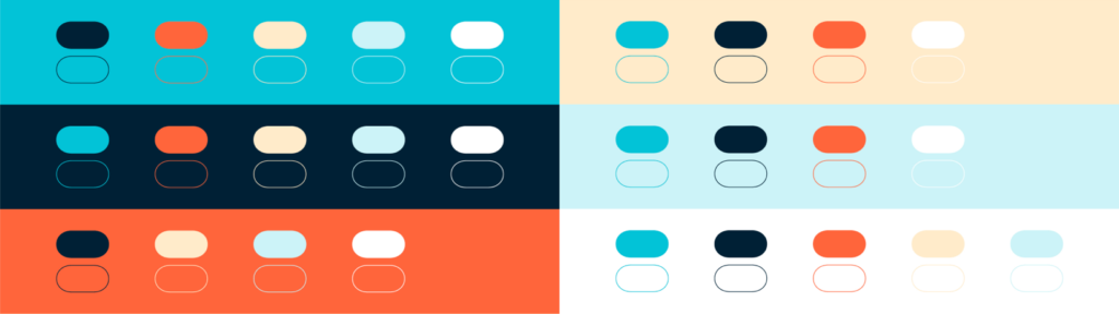
Combinations with a lower contrast can still be used for graphic elements to add background detail and texture but avoid using these combinations for any text or elements that need to be easily understood.
It’s important to take extra car when using Fire Orange. It shouldn’t be used in large areas in our communications. Using it in small quantities allows us to focus on key words or messages so it has much more impact.
Our paler colours of Warm Yellow and Ice Blue shouldn’t be used for text and messaging that needs to be easily read by our audience. unless on a very dark background.
