typography
Words with meaning
Presenting what we have to say to maximise meaning is important – we need to get our message across clearly and quickly. We also need to communicate our attitude and our typography helps us achieve just that.
typography
our typefaces
We use two typefaces for the EvolveYou brand.
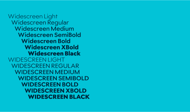
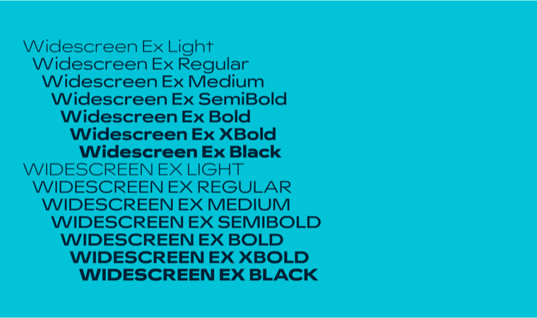
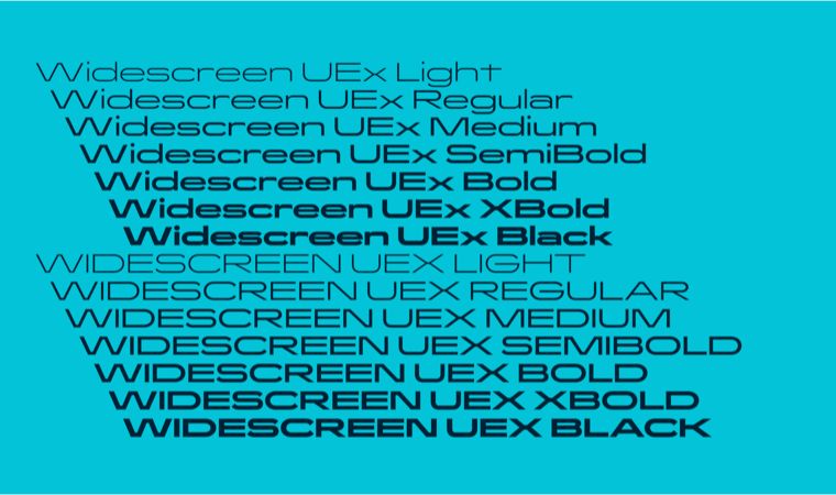
Widescreen is a contemporary sans serif with a bold geometric construction. It comes in a range of widths and weights to provide great flexibility when creating brand communications.
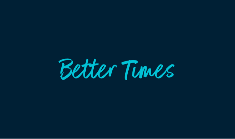
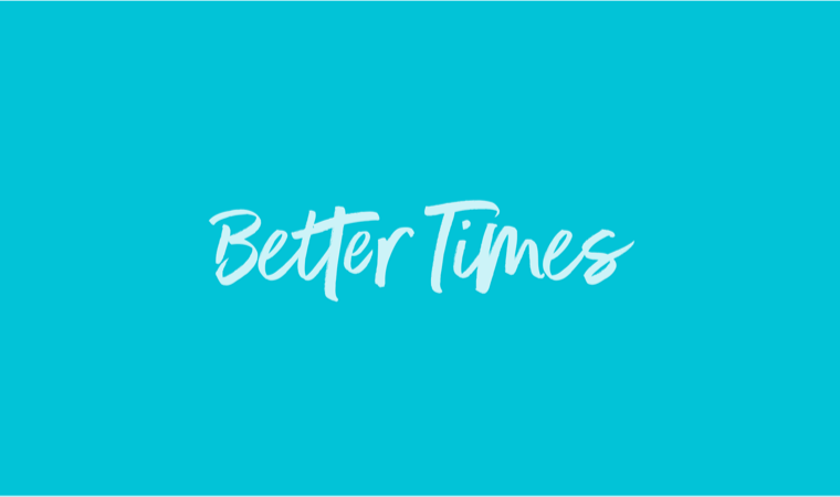
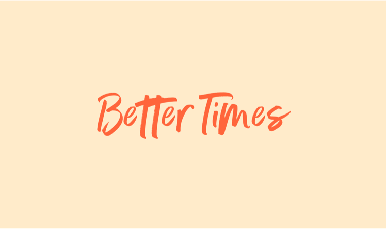
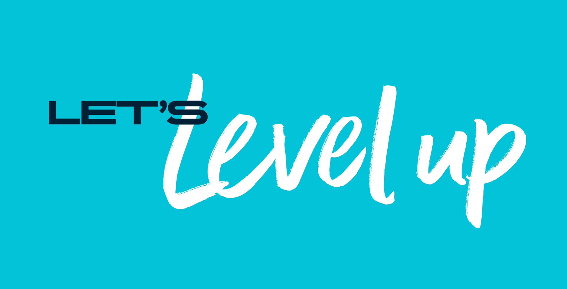
Widescreen is supported by a script typeface called Better Times that injects an energetic handwritten style to bring an active and emotive dimension to messaging.
our typefaces
Widescreen
abcdefghijklmnopqrstuvwxyz
ABCDEFGHIJKLMNOPQRSTUVWXYZ
0123456789
(.,:;?!¿¡…)[&@#]{-–—}«»‹›„“”,‘’_*©®™
£$€¢%+−×÷=≈<>±~
abcdefghijklmnopqrstuvwxyz
ABCDEFGHIJKLMNOPQRSTUVWXYZ
0123456789
(.,:;?!¿¡…)[&@#]{-–—}«»‹›„“”,‘’_*©®™
£$€¢%+−×÷=≈<>±~
abcdefghijklmnopqrstuvwxyz
ABCDEFGHIJKLMNOPQRSTUVWXYZ
0123456789
(.,:;?!¿¡…)[&@#]{-–—}«»‹›„“”,‘’_*©®™
£$€¢%+−×÷=≈<>±~
abcdefghijklmnopqrstuvwxyz
ABCDEFGHIJKLMNOPQRSTUVWXYZ
0123456789
(.,:;?!¿¡…)[&@#]{-–—}«»‹›„“”,‘’_*©®™
£$€¢%+−×÷=≈<>±~
our typefaces
Better Times
abcdefghijklmnopqrstuvwxyz
ABCDEFGHIJKLMNOPQRSTUVWXYZ
0123456789
(.,:;?!¿¡…)[&@#]{-–—}«»‹›„“”,‘’_*©®™
£$€¢%+−×÷=≈<>±~
typography
Headlines
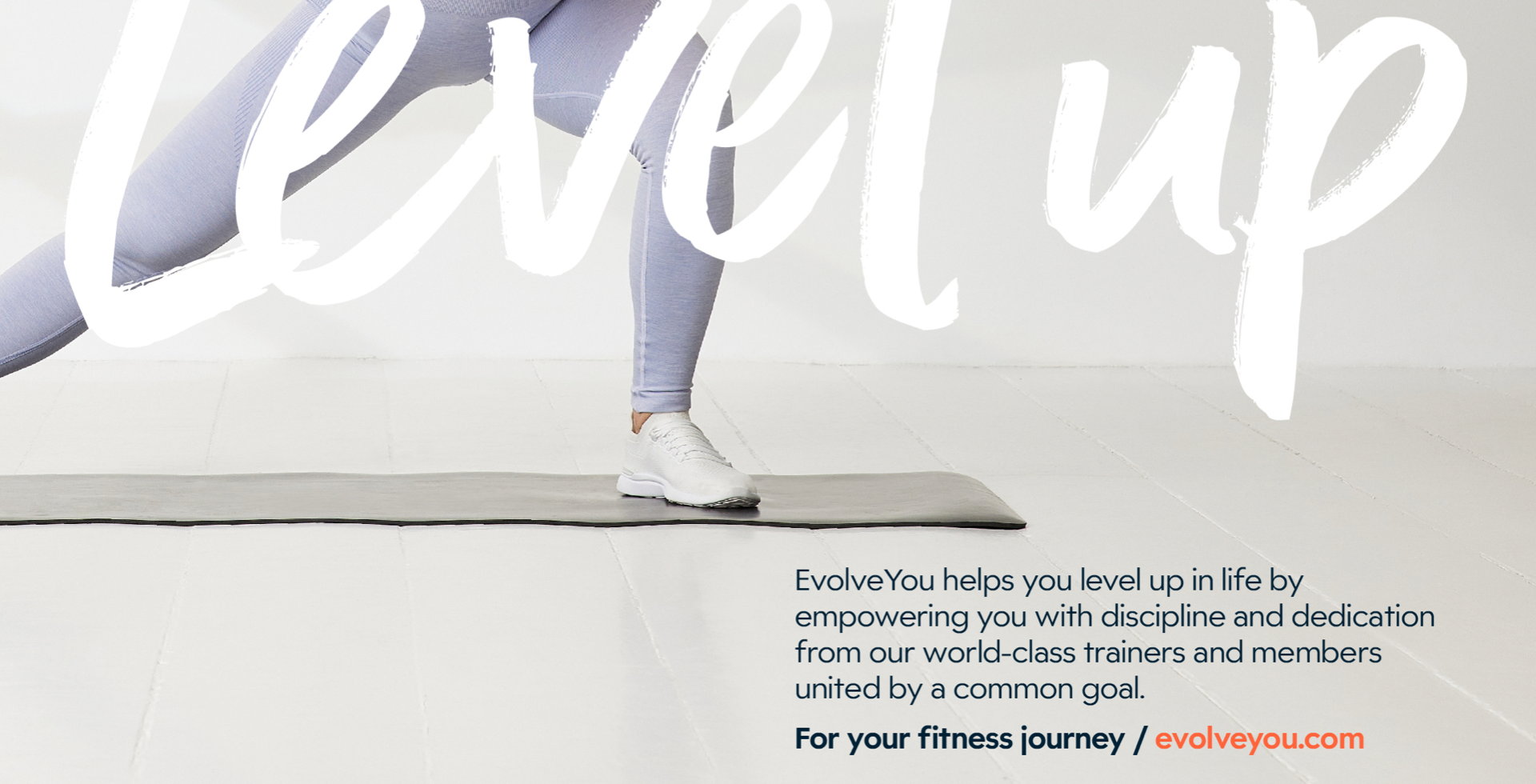
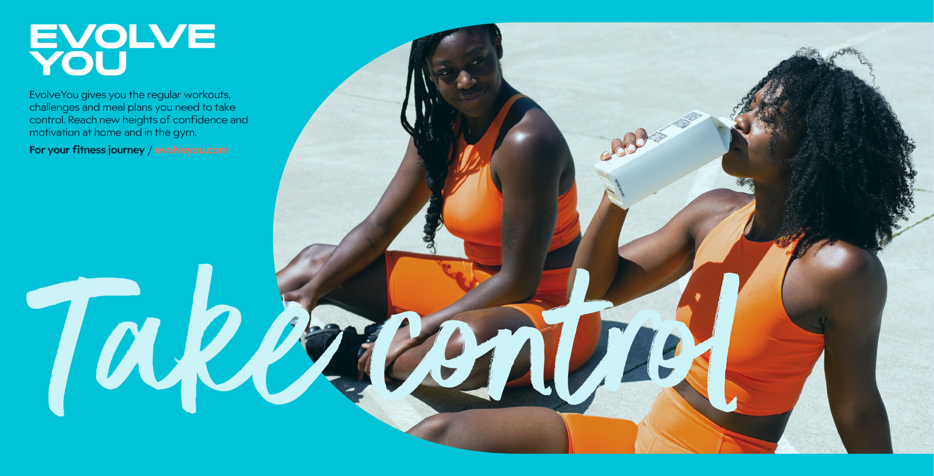
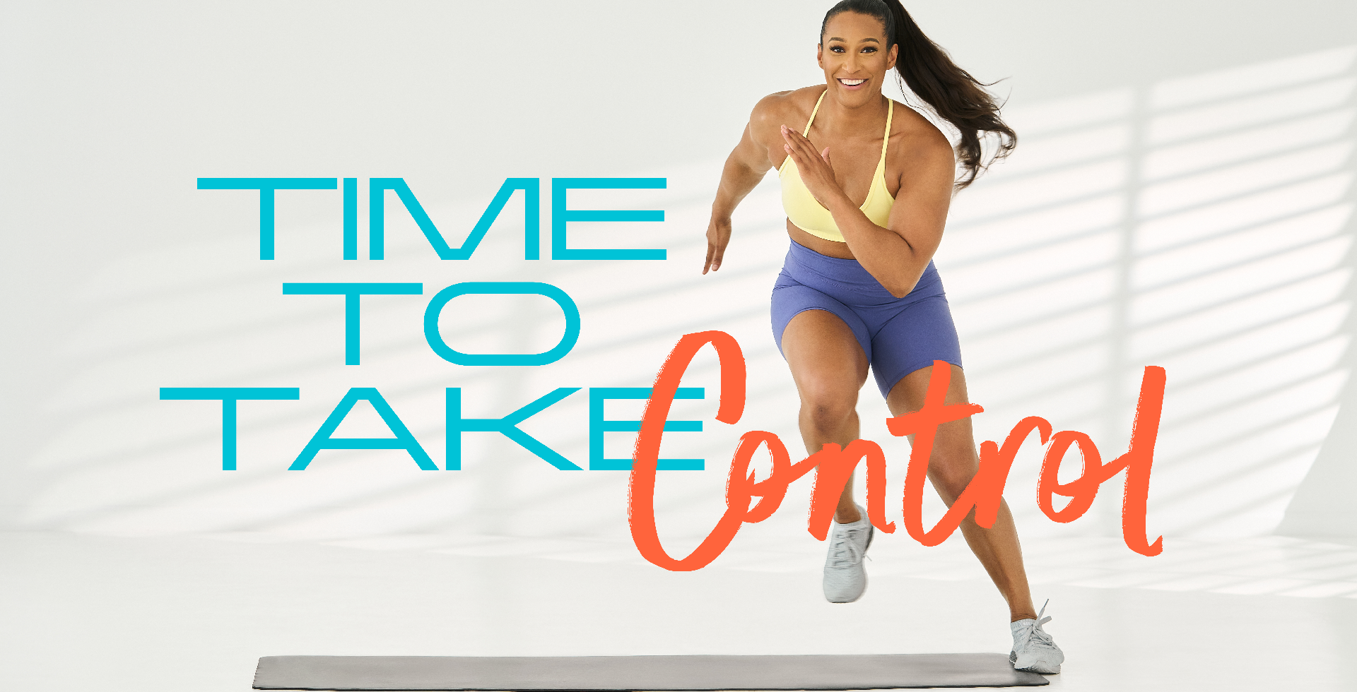
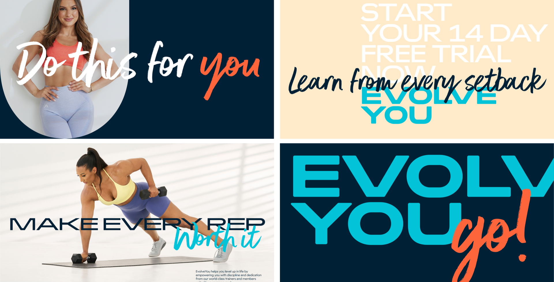
This is where our typographic style is most playful. Combining Widescreen and Better Times brings energy through contrast. We can highlight specific words or phrases to engage our audiences in the best way possible. The two typefaces can be overlapped to give a looser, more spontaneous feel.
using better times
Better Times is full of expressive flair but it can be tricky to read in certain circumstances.
Because of this, it must never be used at small sizes. Only use it for larger headlines, or part of larger headlines when combined with Widescreen. Always double check the size is suitable by reviewing your typography at the correct size to ensure it’s still legible, either for print or online applications.
We also prefer Better Times to be used without any cropping or bleeding off the edge of your design. Again, this is to ensure all messages are as clear and easy to read as possible.
using widescreen
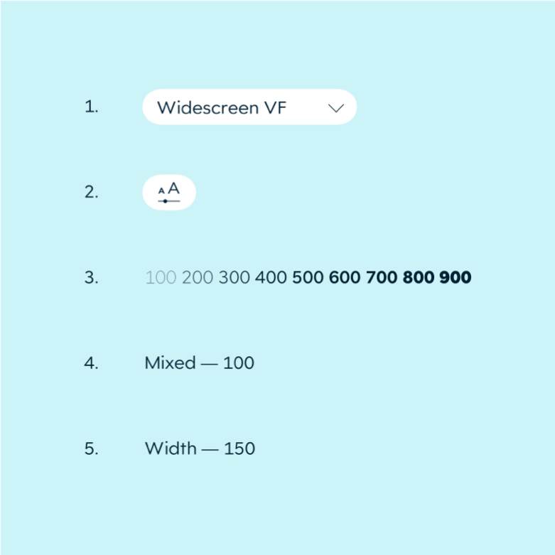
Widescreen has a variety of weights to provide a flexible typographic system.
We do, however, like to keep a degree of consistency. We’d recommend using the following variable type customisation for your headline:
1. Select Widescreen Variable as your font
2. Open the variable type customisation options
3. Set the Weight slider to your chosen weight
4. Set the Mixed slider to 100
5. Set the Width slider to 150.
typography
body copy
For any longer blocks of copy or text at smaller sizes, we use Widescreen but stick to the standard width weights as it’s much easier to read than the extended and ultra extended weights.