iconography
Guiding you along the way
Icons feature throughout our app and products to help everyone find their way around.
iconography
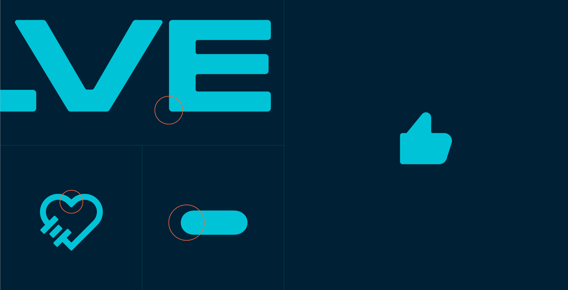
icon style
Our icon set has been developed to work effectively and efficiently in digital applications.

The style is clean and simple with a rounded softness that aligns with the other graphic elements in our toolkit.
icon library
Our library has a huge range of icons available to provide functionality across all touchpoints. We use the Streamline Bold and Streamline Micro Bold libraries as they have a consistent rounded look and feel. The Streamline Micro Bold icons are better for use at smaller sizes, such as the navigation on our app.
When adding any icons, It’s essential that there is clear contrast between the icon and the background on which it’s placed. This helps ensure they are clear and easy to understand at small sizes.
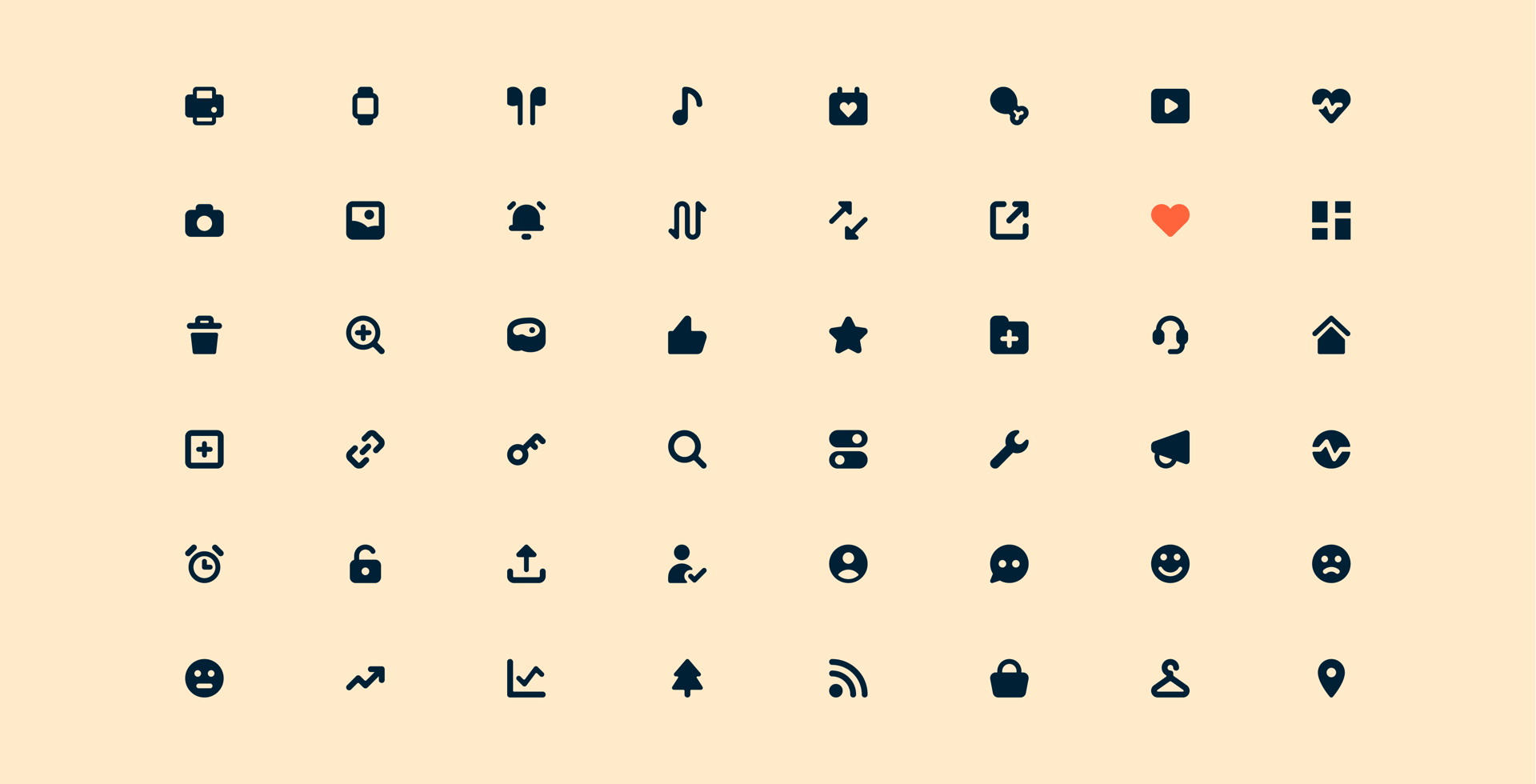
We have organised a basic icon set into the following categories to help you select and apply the correct icons in your design.
Navigation
![]()
Fitness
![]()
Food
![]()
General
![]()